swiecaJS
My thougths on JavaScript, AWS Cloud and other aspects of being Software Engineer
Imagine you have to create a reusable element that will be widely used across your project (or even multiple projects). Before I know about Web Components the natural way of achieving this would be creating a component in some framework (like Vue or React). Then you could easily reuse it.
But there is a native browser way of solving this problem. It’s called Web Components. Let’s create a custom element that could take some content and animate it. It will be similar to what Vue’s slots offer.
Let’s start with basics:
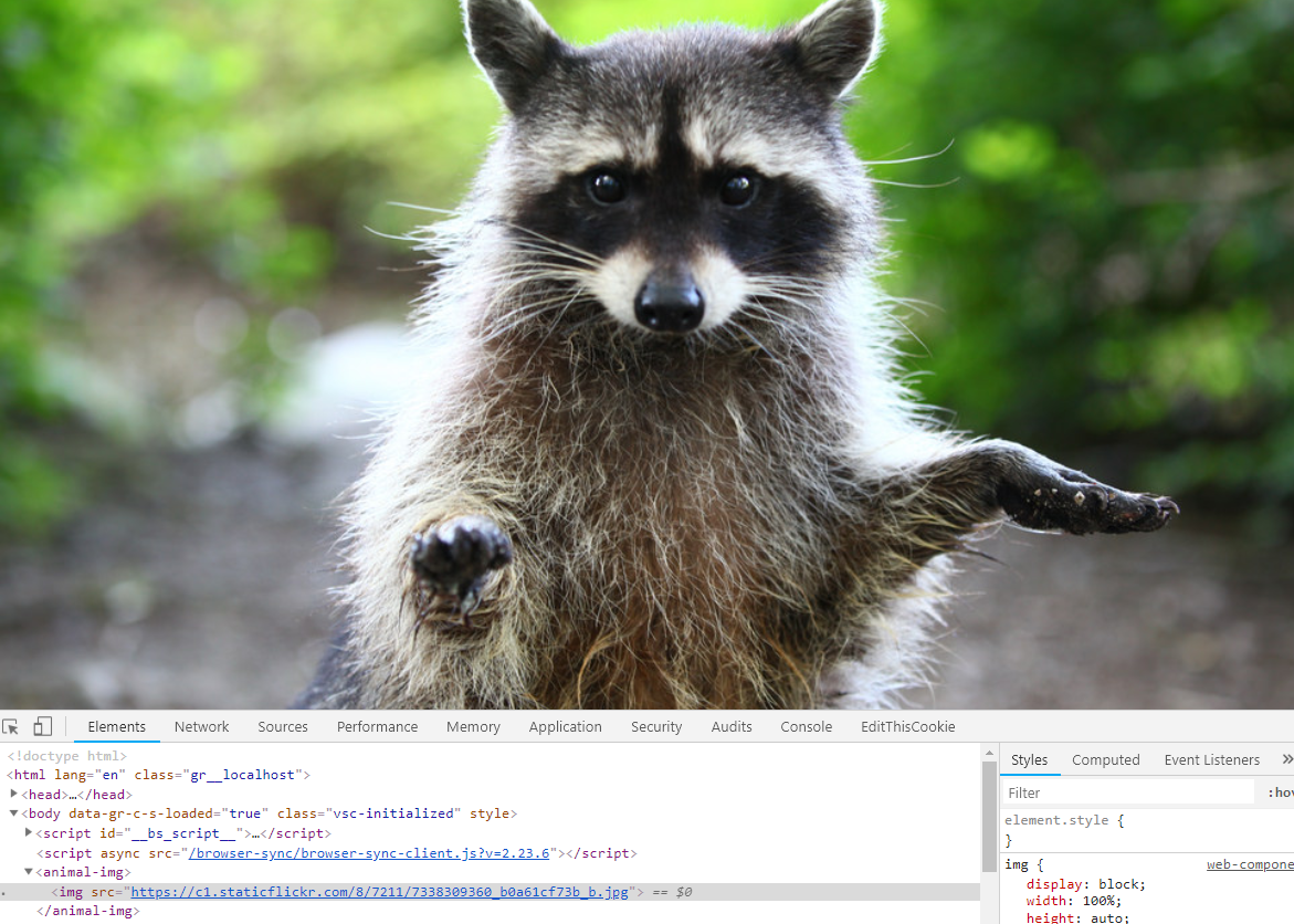
  <animal-img>
    <img src="https://c1.staticflickr.com/8/7211/7338309360_b0a61cf73b_b.jpg">
  </animal-img>
I have created <animal-img> tag and put an image inside. At this moment it will be displayed normally by a browser. And our custom DOM element will be present in the inspector tab.

As I found you should name your custom web components using lowercase and a dash because there is no basic HTML tag containing dash.
But let’s actually make it a working HTML element
  class AnimalImg extends HTMLElement {
    constructor () {
      super()
    }
  }
  customElements.define('animal-img', AnimalImg)
At this point, our component can behave like a normal HTML tag. You can attach an event listener, or use some methods like appendChild. Our output does not change. We still can see a racoon image
Ok now let’s make a slight change in our AnimalImg class:
  class AnimalImg extends HTMLElement {
    constructor () {
      super()
      this.attachShadow({
        mode: 'open'
      })
    }
  }
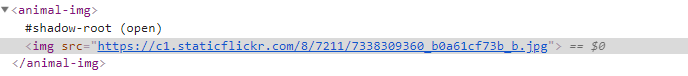
At this moment image will dissappear, and we have just created a shadow-root. Let’s imagine this that your content will be hidden at the beginning, but you can later display it in a way you want.
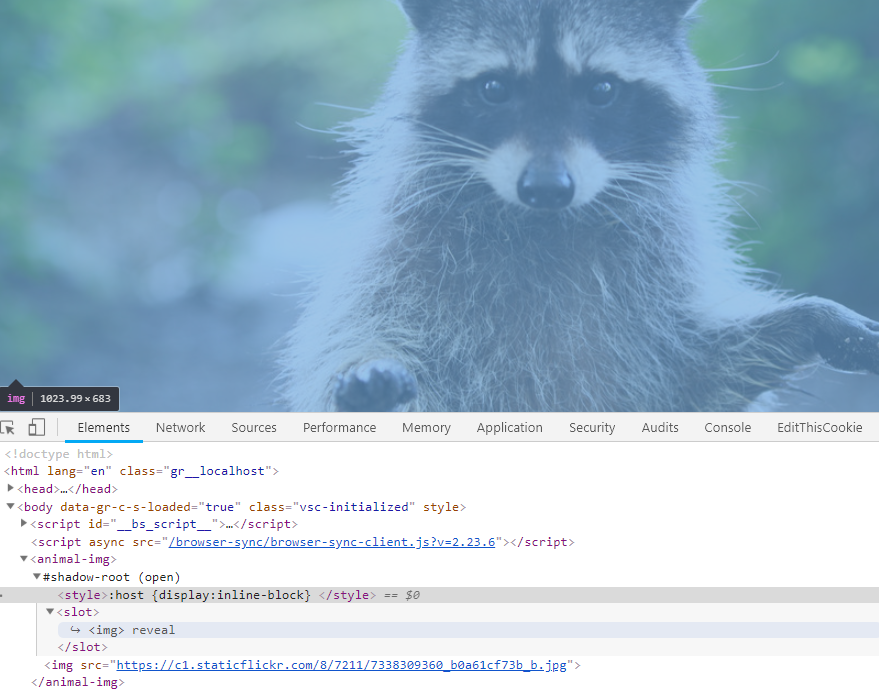
Now we need to create our slot and add it to our Web Component to be able to display what is hidden under #shadow-root. What is really cool we can add a custom CSS inside <style> tag and it will be scoped inside our component!
const template = document.createElement('template')
template.innerHTML = '<style>:host {display:inline-block} </style><slot/>'
Then we need to append this slot to an instance of Web Component. Let’s see how our class looks now.
  class AnimalImg extends HTMLElement {
    constructor () {
      super()
      this.attachShadow({
        mode: 'open'
      })
    }
    connectedCallback () {
      this.shadowRoot.appendChild(template.content.cloneNode(true))
    }
  }
Let’s focus now on a method connectedCallback(). It’s something similar to Vue’s created() or React’s componentDidMount lifecycle methods. It allows running some Javascript when the element is connected to DOM. Similarly, we have disconnectedCallback in Web Components API which is invoked when element will be disconnected.
So our image will now be visible. And in the elements tab of browser’s inspector, you can see a symlink to an image hidden in shadow-root.
That’s great! We can now add some cool animations to our image and have a working component.
  class AnimalImg extends HTMLElement {
    constructor () {
      super()
      this.attachShadow({
        mode: 'open'
      })
    }
    connectedCallback () {
      this.shadowRoot.appendChild(template.content.cloneNode(true))
      this.animate([
        { transform: 'scale(0) rotate(0)' },
        { transform: 'scale(1) rotate(360deg)' }
      ], {
        duration: 1000,
        easing: 'cubic-bezier(0,0,0.3,1)'
      })
    }
  }
The this refers to current instnace of our <animal-img> tag. Below you can see a working example on codepen.
See the Pen My first Web Component by Karol Świeca (@khazarr) on CodePen.
resources