swiecaJS
My thougths on JavaScript, AWS Cloud and other aspects of being Software Engineer
Recently I have a task to prepare a modal that will be displayed on top of a page. Nothing really fancy. So by default I will use below css to position a modal:
  .modal {
    position: fixed;
    left: 0;
    top: 0;
    width: 100%;
    height: 100%;
    display: flex;
    justify-content: center;
  }
If you check on desktop everything looks good
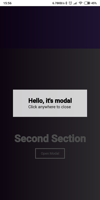
But there is major problem on mobile, due to hiding URL search bar in chrome.
The solution for that is to use 100vh. It’s actually recommended by google.
  .modal {
    position: fixed;
    left: 0;
    top: 0;
    width: 100vw;
    height: 100vh;
    display: flex;
    justify-content: center;
  }
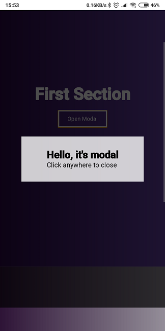
After that it looks much better.
Fixed one
See the Pen modal 100vh height by Karol Świeca (@khazarr) on CodePen.
Buggy on mobile one
See the Pen modal 100% height by Karol Świeca (@khazarr) on CodePen.
resources